So how do we do this?
Firstly we divide the mechanisms as follows:
- Push data – It may sound old fashioned but we believe there will probably always be a requirement in Investment Banks for the medium of predefined reports pushed out to a variety of users on a daily, weekly, monthly basis. It caters well for data views that management wish to customise for their teams…and/or for users who are less comfortable with data mining. We are happy to work with our client’s chosen push reporting tools.
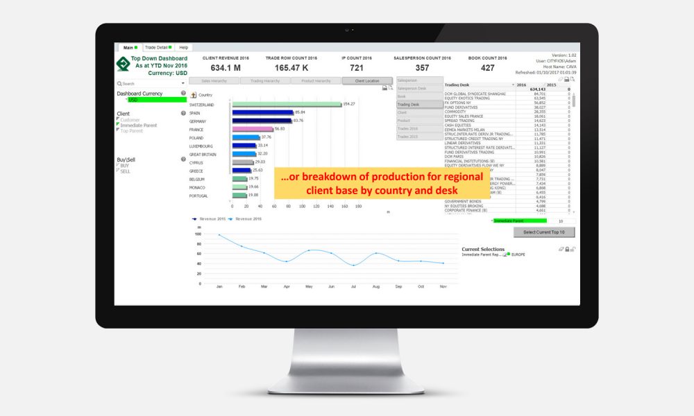
- Pull data – This caters for users who want to see pre-defined views of the data….but then interrogate this data to produce their own analysis and interpretation. For Pull data we use tools such as Qlikview and Tableau in conjunction with our own web based data visualisation apps.The best way to illustrate what we mean by both of these is to show you a few examples…
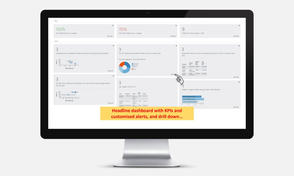
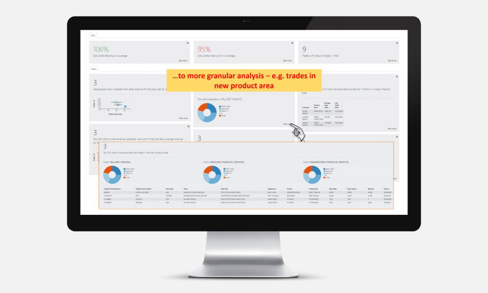
Pull & Push Data – Senior Manager Headlines
Some managers love detail; but some managers prefer to see the headline items quickly and act accordingly.
Click on the images in the presentation to englarge them.
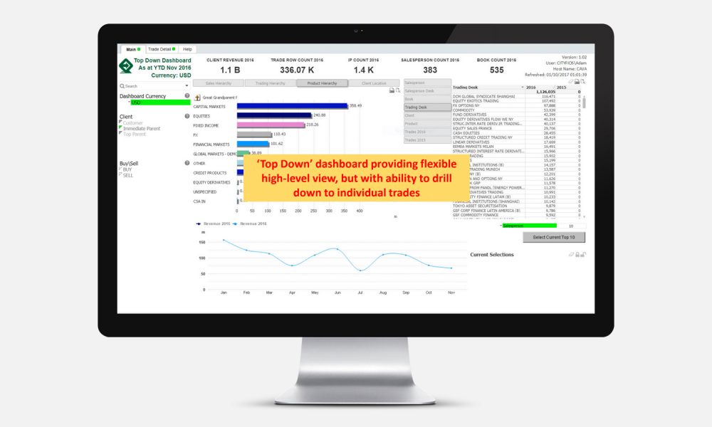
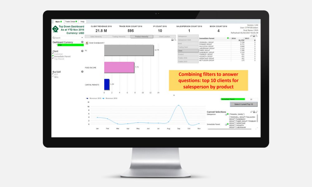
Pull Data – Global Markets Senior Management Overview
Helicopter view allowing senior manages to also dive down into detail where necessary.
Click on the images in the presentation to englarge them.
Push Data
And for those managers who want to see detail and look for trends issues…
Click on the images in the presentation to englarge them.

